What is a hamburger navigation menu?
The hamburger menu has become a staple of modern web design. It’s the three-lined icon you see in the corner of most websites that, when clicked, reveals a hidden navigation menu. The burger menu was first popularized by mobile apps, where screen space is at a premium. However, it quickly became adopted in web design as well, as designers sought to simplify their layouts and create a cleaner look.
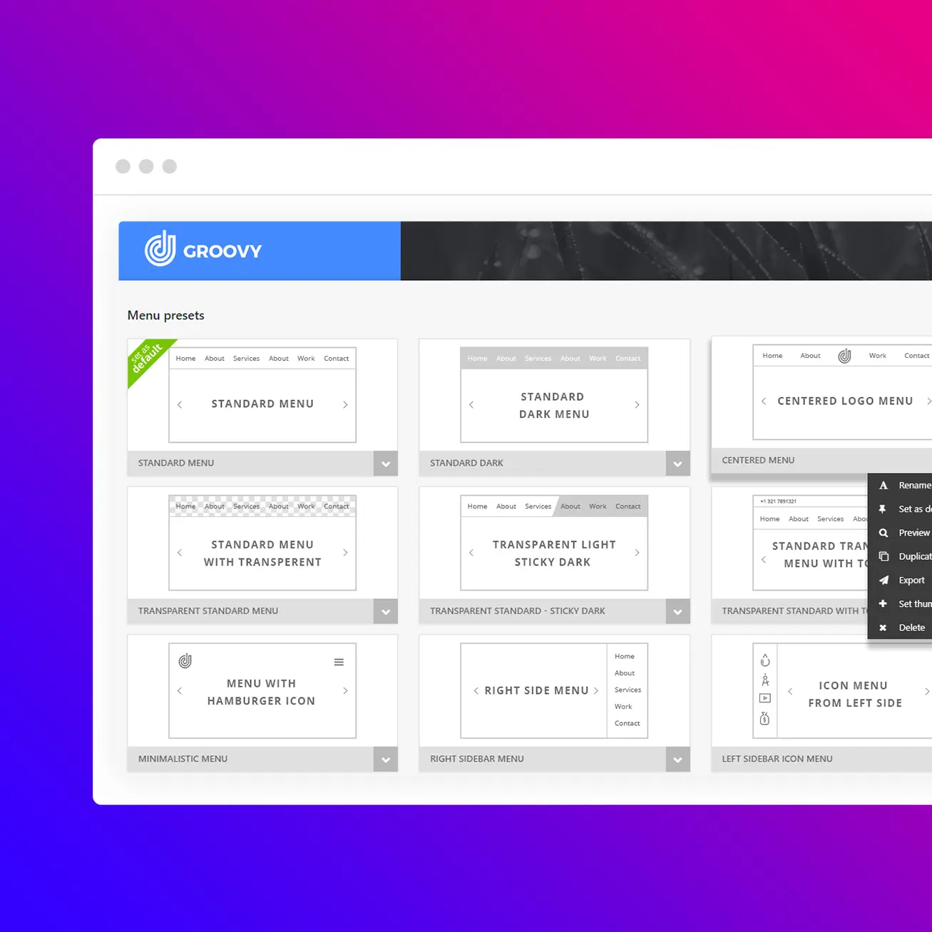
Standard menu
Left sidebar menu
One page menu
Right icon menu
Centered logo menu
Minimalist menu
Left icon menu
Standard menu with topbar
Right sidebar menu
Mobile menu
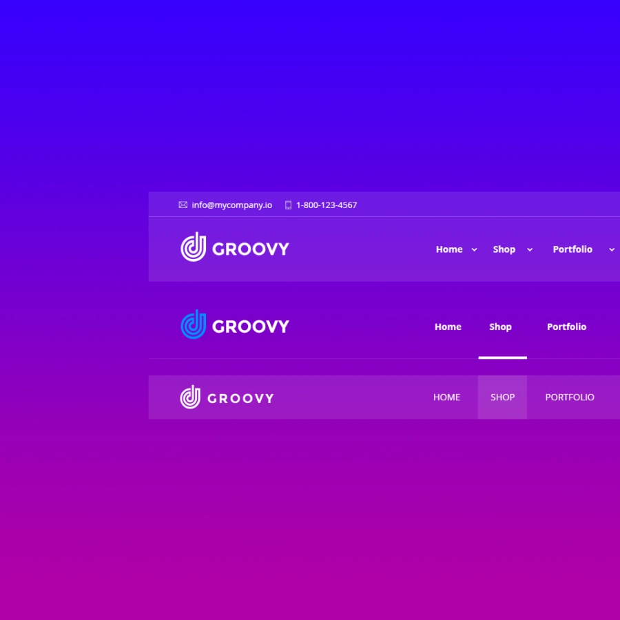
Sticky with topbar
Sticky menu
Benefits
One of the benefits of the hamburger menu in WordPress is that it conserves screen space. By hiding the navigation menu behind an icon, designers can create a more minimalist layout that draws the eye to the most important content on the page. This is particularly useful on mobile devices, where screen real estate is limited. However, some critics argue that the hamburger menu can be confusing for users who aren’t familiar with it. They may not realize that the icon hides a menu, and as a result, they may miss out on important navigation options.
Hamburger menu plugin
Using the Groove Menu plugin, you can easily incorporate a 🍔 hamburger sidebar menu into your website without requiring any coding expertise. Our plugin offers the flexibility to position the menu opening on either the left or right side of the screen or utilize a full-screen menu with an overlay. You can further customize your menu’s appearance and functionality by adding icons, badges, and a toolbar, tailoring it to meet your specific requirements.


