How to Create a Floating Navigation Menu in WordPress in 2023
The way we navigate websites has changed drastically in recent years. With the rise of mobile devices and touchscreens, designers and developers have had to rethink how users interact with them. Modern web site is no longer just about dropdown menus and links. It’s about creating intuitive and seamless experiences that guide visitors to where they want to go, without them even realizing it. In this article, we’ll explore some of the latest trends in site nav and how they’re changing the way we browse the web.
What is a Floating Navigation Menu?
A floating menu, also known as a fixed topbar, is a website design feature that allows the navigation menu to remain visible and accessible as the user scrolls down the page. This feature is commonly used to improve website usability by providing easy access to important pages or sections of the website without requiring the user to scroll back to the top of the page.
This menu type have become increasingly popular in modern design due to their effectiveness in improving UX. Not only do they provide quick access to important sections, but they also eliminate the need for the user to constantly scroll back to the top of the page to navigate. This type of menu design is especially useful for web sites with a lot of content or long pages, as it allows the user to quickly and easily find what they’re looking for. Additionally, floating menus can be designed in a variety of styles and colors, with animation and hover effectes, making them both functional and visually appealing.
Types of Floating menu
- Fixed top navbar The fixed top navbar is the most common type of sticky header, as it provides easy access to the main navigation menu at all times. This type of header is ideal for long pages, blog posts, and category pages, where users need to scroll through a lot of content. The fixed top navbar can also include other important information, such as a search bar, social media links, or a logo.
- Fixed left navbar Some websites prefer to position their navigation menu to the left or right of the page, rather than at the top. A fixed left navbar can be a good choice for creative businesses, clothing brands, or websites with a strong modern or contemporary design. This type of sticky header can make the menu items less intrusive and add a unique touch to the website’s overall design.
- Fixed right navbar Some sites prefer to position their menu to the left or right of the page, rather than at the top. A fixed left navbar can be a good choice for creative businesses, clothing brands, or websites with a strong modern or contemporary design. Sticky menu on scroll can make the menu items less intrusive and add a unique touch to the website’s overall design
Pros of Floating Navigation Menus
1. Improved User Experience
Floating menus offer several benefits to both website designers and users alike. One of the main advantages of a floating menu is that it provides a clear and constant nav for users, no matter where they are on the page. This can help improve the user experience by making it easier for them to find what they’re looking for without having to navigate through multiple pages or sections. Additionally, by keeping the menu visible at all times, floating menus can help reduce bounce rates and increase engagement by encouraging users to explore the website further.
2. Saved Screen Space
Another benefit of using a floating menu is that it can save valuable screen space. Since the menu is always visible and accessible, there’s no need to dedicate a large portion of the screen to the topbar. This can be especially beneficial for mobile devices, where screen real estate is at a premium. By using a float header, designers can create mobile menu sticky that provide more streamlined and efficient user experience that’s optimized for smaller screens.
3. Improved Website Accessibility
Finally, floating menus can help improve website accessibility. For users with disabilities or impairments that affect their ability to use a mouse or trackpad, scrolling back to the top of the page to access the fixed navbar can be a frustrating and time-consuming process. By providing a floating menu that’s always visible and accessible, designers can make their websites more user-friendly and inclusive for all users, regardless of their physical abilities.
Cons Floating Navigation Menus
1. Can be Distracting
While floating menu can be a helpful tool for website usability, they can also be distracting to users. The constant presence of the menu on the screen can take away from the main content of the website and make it difficult for users to focus on what they’re reading or viewing. This can be especially problematic for websites with lots of text or visual content, where users need to be able to concentrate on the material.
2. Can Be Confusing
Another potential issue with float menu is that they can be confusing for some users. Since the menu is always present on the screen, some users may not realize that they need to scroll down to see more content or information. This can lead to frustration and confusion, particularly if the website has a lot of information to convey. Additionally, if the menu is not well-designed or organized, it can be difficult for users to find the specific information they need.
3. Can Affect Load Times
Finally, floating menus can also affect website load times. Since the menu is always present on the screen, it requires additional resources to load and display properly. This can slow down the website and make it more difficult for users to navigate. Additionally, if the website has a lot of other design elements or features, the floating menu can add to the overall load time, which can negatively impact user experience and engagement.
How to Add a Floating Navigation Menu in WordPress
A floating menu can be implemented using a variety of techniques, including CSS, JavaScript and simple way is use special plugin.
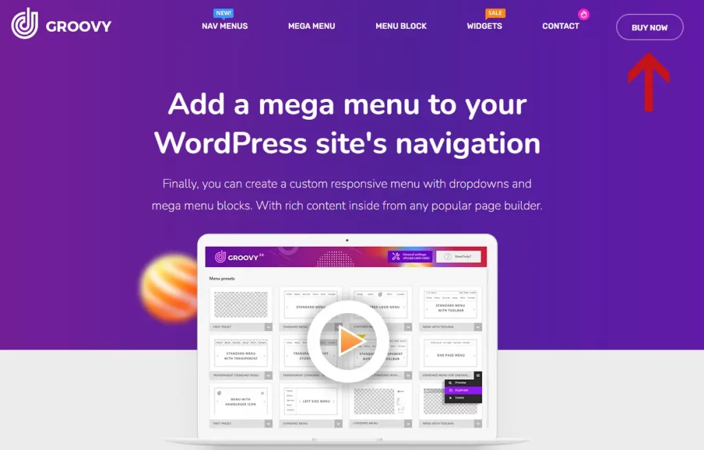
To add a float navigation menu to WordPress website, you can use the Groovy Menu plugin. However, please note that feature isn’t available in FREE plugin, only available float menu in Pro plugin.
If you have purchased a license for the Groovy Menu plugin, you can follow these steps to implement the floating menu feature:
How to add Floating menu with Plugin
- Download and install the groovy-menu.zip file, which is the plugin file itself. Be sure not to confuse it with the Groovy-Menu_package.zip bundle file.
- Integrate the plugin using one of the methods described in the Groovy Menu plugin documentation.
- Create a new preset or import presets from the online library.
- To enable the Sticky menu feature, go to the ‘General settings‘ tab and select ‘Sticky menu behavior‘ From there, choose the ‘Fixed Sticky‘ or ‘Slide Down‘ option for Desktop and Mobile devices.
- Preview your preset and save the changes.
By following these steps, you can successfully add a floating navigation header to your WordPress website using the Groovy Menu plugin.
One common approach is to use CSS to set the menu position to “fixed” and the top offset to a value that ensures the menu remains visible as the user scrolls. JavaScript can be used to further customize the behavior of the floating menu, such as adding animations or transitions.
How to add floating menu with CSS
Here is example code for a floating menu:
/* Set the position of the menu */
.floating-menu {
  position: fixed;
  top: 0;
  left: 0;
  z-index: 9999; /* Ensure that the menu is always on top */
  background-color: #fff; /* Change the background color to match your design */
  width: 100%; /* Set the width of the menu */
  box-shadow: 0px 2px 10px rgba(0, 0, 0, 0.3); /* Add a shadow effect */
}

/* Style the menu items */
.floating-menu ul {
  list-style: none; /* Remove the default list style */
  margin: 0;
  padding: 0;
  display: flex;
}

.floating-menu li {
  margin: 0 10px; /* Add space between each item */
}

.floating-menu a {
  display: block;
  padding: 10px;
  color: #000; /* Change the color to match your design */
  text-decoration: none;
}

/* Add a hover effect to the menu items */
.floating-menu a:hover {
  background-color: #f2f2f2; /* Change the background color on hover */
}
How to add floating menu with CSS and JS
Here is just example code of floating menu:
CSS
/* Set the position of the menu */
.floating-menu {
  position: fixed;
  top: 0;
  left: 0;
  z-index: 9999; /* Ensure that the menu is always on top */
  background-color: #fff; /* Change the background color to match your design */
  width: 100%; /* Set the width of the menu */
  box-shadow: 0px 2px 10px rgba(0, 0, 0, 0.3); /* Add a shadow effect */
  transition: all 0.3s ease; /* Add a transition effect */
}

/* Style the menu items */
.floating-menu ul {
  list-style: none; /* Remove the default list style */
  margin: 0;
  padding: 0;
  display: flex;
}

.floating-menu li {
  margin: 0 10px; /* Add space between each item */
}

.floating-menu a {
  display: block;
  padding: 10px;
  color: #000; /* Change the color to match your design */
  text-decoration: none;
}

/* Add a hover effect to the menu items */
.floating-menu a:hover {
  background-color: #f2f2f2; /* Change the background color on hover */
}

/* Add a class to the menu when it's fixed */
.floating-menu.fixed {
  top: 0;
  box-shadow: 0px 2px 10px rgba(0, 0, 0, 0.3); /* Add a shadow effect */
  background-color: #fff; /* Change the background color to match your design */
}

/* Add a class to the menu when it's slid down */
.floating-menu.slide-down {
  top: -100px;
}
JavaScript
// Get the menu element
var menu = document.querySelector('.floating-menu');

// Get the offset position of the menu
var menuOffset = menu.offsetTop;

// Function to toggle the classes on the menu
function toggleMenuClasses() {
  if (window.pageYOffset >= menuOffset) {
    menu.classList.add('fixed');
    menu.classList.remove('slide-down');
  } else {
    menu.classList.remove('fixed');
    menu.classList.add('slide-down');
  }
}

// Call the function on scroll
window.addEventListener('scroll', toggleMenuClasses);
Conclusion
The use of a floating menu can have several benefits for a website. First, it can improve the user experience by making navigation more convenient and efficient. Second, it can increase engagement and reduce bounce rates by making it easier for users to access important content. Finally, it can provide a consistent visual element that reinforces the branding of the website.
However, there are also potential drawbacks to using a floating menu. For example, it can take up valuable screen space and detract from the overall design of the website. Additionally, some users may find the persistent presence of the menu distracting or annoying.
Overall, the decision to use a floating menu should be based on the specific needs and goals of the website. By carefully considering the advantages and disadvantages, website designers can create an effective and user-friendly design that meets the needs of their audience.