Pros and Cons of Using Transparency in Website Menus and Mega Menus
In recent years, transparency in user interface design has become a popular trend in website design. Transparency can be applied to various elements of a website, including menus, mega menus, and other interface elements. In this article, we will explore the pros and cons of using transparency in user interface design, specifically with menus and mega menus.
Transparency in User Interface Design Transparency in user interface design refers to the use of partially transparent elements in a website’s interface. This can include background images, buttons, and even entire menus or mega menus. The level of transparency used in these elements can vary from subtle to bold, depending on the designer’s preferences.
Here are some examples of websites that use transparent menus, interfaces, and mega menus:
Apple.com
Apple’s website often features transparent elements, including the mega menu that appears when hovering over the “Mac” or “iPad” sections. The transparency adds a modern, sleek look to the menu, while still making it easy to read and navigate.
![]()
Squarespace menu
Squarespace’s website uses a transparent menu for its main navigation, which appears when hovering over the “Menu” button. The transparency level is subtle, creating a sense of depth and making the menu stand out from the content.
![]()
Amazon Prime Video website menu
Is an online video streaming service that offers a vast selection of movies and TV shows for its subscribers. The website features a transparent menu that is displayed at the sidebar, allowing users to navigate the site easily.
![]()
Jessica Walsh
Jessica Walsh is a graphic designer and art director who uses a partially transparent menu bar that appears fixed at the top of the page. The transparency level is subtle, making it easy to read the menu items while still allowing the background color to show through.
![]()
Snowe
Snowe is a home goods and decor e-commerce website that uses a partially transparent menu bar that appears fixed at the top of the page. The transparency level is subtle, making it easy to read the menu items while still allowing the background color to show through.
![]()
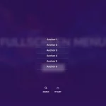
Jonas Eriksson
Jonas Eriksson is a product designer who features a transparent menu for his main navigation, which appears when click on hamburger menu. After clicking on a hamburger, a transparent fullscreen menu appears. Such a menu can also be made with the Groovy menu plugin.
![]()
Made Thought
Made Thought is a design agency that uses a partially transparent menu bar that appears fixed at the top of the page. The transparency level is subtle, making it easy to read the menu items while still allowing the background color to show through.
![]()
Tim Tadder
Tim Tadder is a photographer who features a transparent centered logo alignment menu for his main navigation. The transparency level is moderate, creating a sense of depth and making the menu stand out from the content.
![]()
Astro Gaming
Astro Gaming is a popular website that provides gaming headsets and accessories. The website features a transparent menu that is visible at the top of the page, making it easy for visitors to navigate through the site.
![]()
These are just a few examples of websites that use transparent menus, interfaces, and mega menus. The use of transparency can vary depending on the website’s design and goals, but when used correctly, it can add a modern, sleek look to the interface while still maintaining a clean, easy-to-use design.
Pros of Transparency in Menus and Mega Menus
- Attractive Aesthetics: Transparency in menus and mega menus can add a touch of elegance and visual appeal to a website. By creating a sense of depth and layering in the interface, the website can look more modern and sophisticated.
- Increased User Engagement: Transparent menu and mega menus can help users focus on the content they are viewing. This is because transparency allows the content behind the menu or mega menu to be slightly visible, making it easier for users to relate and connect with the content.
- Clear and Simplified Interface: By using transparency, designers can create a clean and simple interface that is easy to navigate. This can be achieved by hiding navigation elements when not needed, and revealing them when the user needs to access them.
Cons of Transparency in Menus and Mega Menus
- Potential for Visual Distraction: When used improperly, transparency can be a distraction to users. If the transparency level is too high, it can interfere with the readability of the text, making it difficult for users to navigate the website. This can be especially problematic for users with visual impairments.
- Limited Accessibility: Transparent menus and mega menus can be challenging for some users to navigate. This is because the menus or mega menus may not be distinguishable from the content behind them, making it difficult for users to locate and use them.
Conclusion
In conclusion, transparency in user interface design can be an excellent way to enhance the aesthetics of a website and increase user engagement. However, transparency must be used carefully to ensure that it does not become a distraction to users or limit accessibility. Ultimately, transparency should be used to enhance the user experience and not hinder it. It is important for designers to consider the pros and cons of transparency when designing menus and mega menus, and to use it only when it is appropriate for the website’s design and goals.