Enhancing User Experience with Full Screen Navigation
Full screen navigation has become increasingly popular as a way to streamline the navigation experience on a website. It’s a type of menu that occupies the entire screen, replacing the current content by pushing it off the screen.
And provides users with a more immersive browsing experience by creating a sense of focus and guiding them towards the most important sections of the website. It’s often visually appealing, with large typography and eye-catching graphics that draw the user’s attention.
One of the primary benefits of full screen menu is its ability to simplify the user experience. By replacing the current content with the menu, it can reduce clutter and minimize distractions, allowing users to focus on the navigation options at hand. This is particularly useful for websites with complex navigation structures.
Traditional horizontal navigation are limited by the size and layout of the website, full screen navigation can be customized to fit any design or layout. This means that designers can create unique menus that are tailored to the needs of their users.
However, full screen navigation can be difficult to access on mobile devices where screen real estate is limited. Additionally, it can be resource-intensive, which can lead to longer load times and slower performance.
Despite these potential issues, full screen navigation remains a popular option for many websites, particularly those in the creative industries. Artist sites, designers, and other creative professionals often prioritize visual impact and user experience, making full screen navigation an attractive option.
Pros:
- Visual Appeal: A full-screen menu can provide an impressive visual experience to users. It can showcase the website’s design and content in a visually stunning way, especially when paired with high-quality images or videos.
- User-Friendly: Full-screen menus can be very user-friendly, especially for those who are not familiar with the website. It provides a clear and concise way for users to navigate the website, making it easier to find what they are looking for.
- Mobile-Friendly: Full-screen menus are often designed to be responsive, making them ideal for mobile devices. It provides a seamless user experience on smaller screens, ensuring that users can easily navigate the website on their mobile devices.
- Simplified Navigation: Full-screen menus are designed to simplify the navigation process for users. It provides a clear and concise way for users to navigate the website, reducing the need for users to scroll through pages to find what they are looking for.
Cons:
- Takes up screen space: While full-screen menus can be visually appealing, they do take up a lot of screen space. This can be a problem, especially on smaller screens, as it can be challenging for users to view the website’s content.
- Lack of Visibility: Full-screen menus may not be as visible as traditional menus. Users may overlook them, resulting in a less-than-ideal user experience.
- Longer loading times: Full-screen menus may increase loading times, particularly for websites with high-quality images or videos. This can lead to a frustrating user experience.
- Inconsistent Design: Full-screen menus can be inconsistent across different devices and browsers, leading to a less-than-ideal user experience.
Examples of Websites Using Full-Screen Menus:
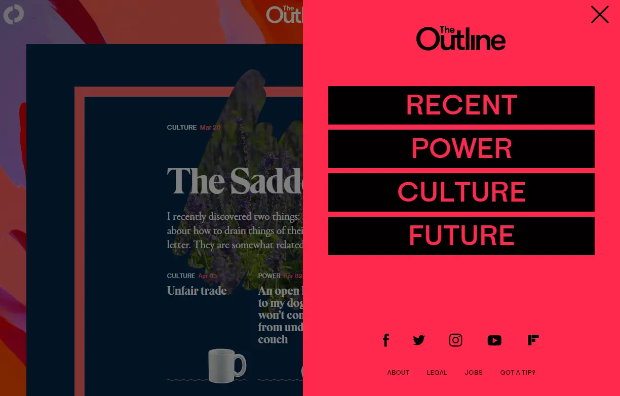
The Outline: This digital magazine website features a full screen navigation menu that pops up from the left side of the screen when the user clicks on the menu icon. The menu options are displayed in a vertical list, with bold typography and clear spacing for easy navigation. The full screen menu helps to declutter the homepage and allows for a cleaner design aesthetic.
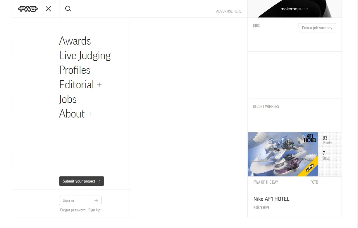
The FWA – This website features a full screen navigation with a playful, interactive design. When you click on the hamburger menu icon, the navigation options appear in a circular shape with a spinning animation effect. The typography is bold and colorful, with a creative use of negative space.
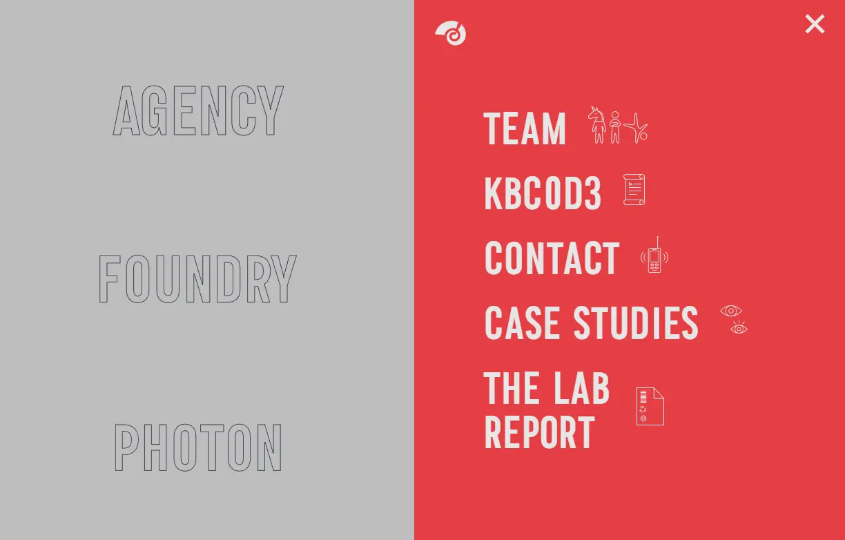
KOBU Agency – This website has a sleek and modern design with a full screen navigation that seamlessly blends into the overall aesthetic. The menu options are displayed as large, bold typography that appears to float in mid-air.
Erikssonjonas.com is a good example of a creative website that has a full-screen menu. The website features a bold, minimalistic design with a black and white color scheme. When the menu button is clicked, the entire screen is taken over by a black overlay that displays the menu options in white typography.
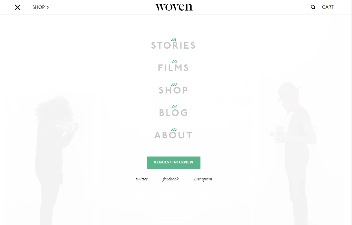
Woven Magazine – Woven Magazine is a print and online publication that showcases the work of emerging artists and designers. The website features a full-screen menu that provides easy navigation to different articles and features.
Conclusion
Overall, full screen navigation can be a powerful tool for simplifying the user experience and creating an immersive browsing experience. Whether used for a primary navigation menu or as a supplement to traditional navigation options such as additional menu, it can guide users towards the most important sections of a website, ultimately improving engagement and conversions.
In conclusion, fullscreen menus can be a visually stunning and user-friendly navigation option for websites, particularly for artists, designers, and other creative professionals. While there are some drawbacks to using a full-screen menu, they can provide a simplified and streamlined user experience. However, it’s important to keep in mind the cons when deciding to use a fullscreen menu and to test it on different devices and browsers to ensure consistency and accessibility.