-
×
 Product with options
1 × $40.00
Product with options
1 × $40.00
Subtotal: $40.00
 Product with options
1 × $40.00
Product with options
1 × $40.00 Subtotal: $40.00
When designing a website or application, the navigation is one of the most important elements to consider. It is the key to providing users with an easy and efficient way to access the content they are looking for. One popular approach to navigation is using a combination of a top navigation bar and a left navigation bar, also known as a sidebar. In this article, we will explore the benefits of using a top navigation bar with a left navigation bar, and provide some tips for implementing this approach.
The combination of a top navigation bar and a left navigation bar offers several benefits for users, including:
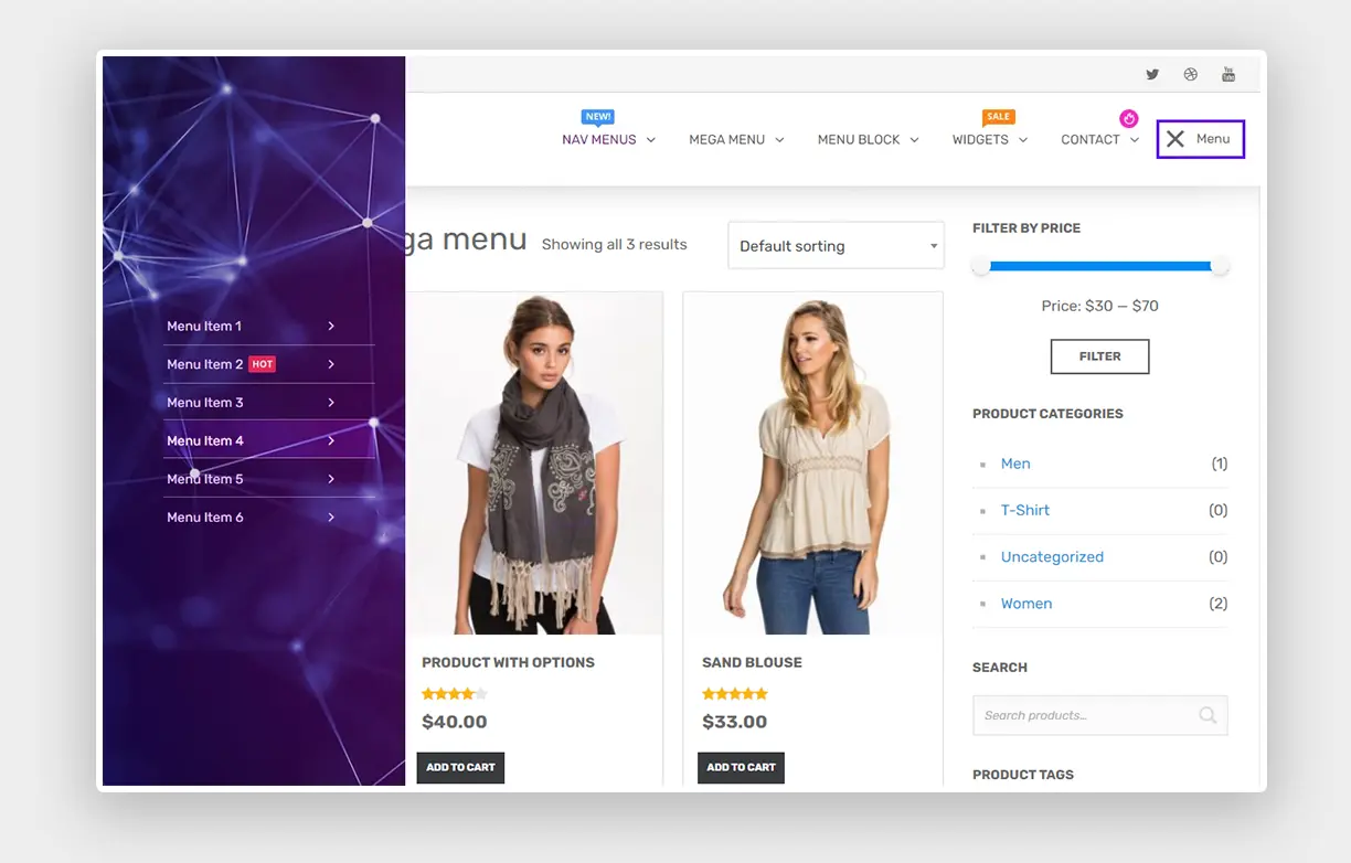
Clear and organized navigation: By having the main navigation options in the top navigation bar and the sub-navigation options in the left navigation bar, users can quickly and easily find the content they are looking for. This approach also helps to reduce clutter on the screen, making it easier for users to focus on the content.
Consistency: By having the main navigation options in the top navigation bar, users can easily navigate to different sections of the site, while the left navigation bar provides consistent access to sub-navigation options.
Flexibility: With a left navigation bar, users can easily navigate to different sections of the site without having to go back to the main navigation options in the top bar. This approach is particularly useful for sites with a large number of pages or sections.
Implementing Top Navigation with Left Navigation Bar
When implementing a top navigation bar with a left navigation bar, there are several key factors to consider:
Information architecture: The first step in implementing this approach is to define the information architecture of the site. This involves identifying the main navigation options that will be displayed in the top navigation bar, as well as the sub-navigation options that will be displayed in the left navigation bar.
Design: The design of the top navigation bar and left navigation bar should be visually consistent, and the two should be connected in a logical way. For example, the left navigation bar should have clear headings and subheadings that correspond to the main navigation options in the top bar.
User testing: Once the design is complete, it is important to test the navigation with actual users to ensure that it is intuitive and user-friendly. This can involve conducting user testing sessions, gathering feedback through surveys or other feedback tools, or analyzing user behavior through analytics.
Clear organization: A top navigation bar with a left navigation bar helps to organize the content and provide a clear structure to the user. This can make it easier for users to find the information they are looking for.
Consistency: By having the main navigation options in the top navigation bar and sub-navigation options in the left navigation bar, users can quickly and easily find the content they need. This approach also helps to provide a consistent user experience throughout the site.
Flexibility: With a left navigation bar, users can easily navigate to different sections of the site without having to go back to the main navigation options in the top bar. This approach is particularly useful for sites with a large number of pages or sections.
Screen space: Using a top navigation bar with a left navigation bar can help to save screen space by reducing the need for additional menus or navigation options.
Complex design: A top navigation bar with a left navigation bar can be complex to design, particularly when it comes to information architecture and navigation flow. This can make it more difficult to implement, particularly for less experienced designers.
Overwhelming: For users who are not used to this type of navigation, a top navigation bar with a left navigation bar can be overwhelming and confusing. This can be particularly true for sites with a large number of pages or sections.
Limited space: In some cases, a top navigation bar with a left navigation bar may not be suitable for sites with limited screen space or where there are multiple other elements on the page that need to be displayed.
Not suitable for all types of sites: A top navigation bar with a left navigation bar may not be the best approach for all types of sites or applications, particularly those with more limited content or a simpler navigation structure.
These examples demonstrate how a top navigation bar with a left navigation bar can be used across a variety of different websites and applications, from project management software to online education platforms to customer communication tools. The key is to consider your specific needs and user expectations when designing your navigation structure, and to ensure that it provides a clear and organized way for users to find the information they need.
Top navigation with a left navigation bar is a popular approach to navigation that can provide users with a clear, organized, and consistent way to access the content they are looking for. When implementing this approach, it is important to consider the information architecture, design, and user testing to ensure that the navigation is easy to use and meets the needs of your users. By following these tips, you can create a user-friendly navigation experience that will help your site or application stand out.
You must be logged in to post a comment.
4 Comments
Mauris ut aliquet orci. Curabitur ac ex placerat, fringilla risus tempor, vulputate metus.
Lorem ipsum dolor sit amet, consectetur adipiscing elit. Curabitur ac ex placerat, fringilla risus tempor, vulputate metus. Morbi sit amet lorem fringilla, tempor tellus eu, venenatis augue. Nulla cursus orci id auctor varius. Duis vulputate.
Could you explain to me how to add a CTA button to the menu using the Groovy menu? And is it possible to add an AJAX search input to the Topbar menu? Also, I would like to customize the menu. Do you offer customization services as an extra?
Is it possible to make the fullscreen menu a transparent overlay? Can nesting be used with this type of menu?