-
×
 Product with options
1 × $40.00
Product with options
1 × $40.00
Subtotal: $40.00
 Product with options
1 × $40.00
Product with options
1 × $40.00 Subtotal: $40.00
When browsing the internet on a mobile device, you’ve probably noticed a small three-line icon in the corner of the screen. This icon, commonly referred to as the hamburger menu has become a popular way for websites to display their navigational elements in a compact and easily accessible manner.
Instead of taking up valuable screen real estate with a traditional menu, the hamburger menu collapses all of the navigation options into a small, recognizable icon. When tapped, the menu expands to reveal a list of links or other navigational elements.

The hamburger button (the triple bar ≡ or trigram ☰), has become a ubiquitous feature on websites and mobile apps, recognized by its three horizontal lines representing a menu. But where did this icon come from, and how did it become so popular?
The hamburger button was first introduced by designer Norm Cox in the early 1980s as part of the user interface for the Xerox Star, one of the first graphical user interfaces. However, it was not widely adopted until the rise of mobile devices and responsive web design in the early 2010s.
One of the key benefits of the hamburger button is that it allows designers to save space on smaller screens, while still providing access to important navigation options. It also provides a cleaner, minimalist design that is favored by many modern websites.
However, the use of the hamburger button has not been without controversy. Some argue that it is not intuitive for users, particularly those who are not familiar with mobile apps. Additionally, there is a concern that it can lead to hidden navigation options that users may not be aware of.
Despite these criticisms, the hamburger button remains a popular choice for designers and developers, with many variations and styles available. From the classic three-line design to more creative and playful interpretations, the hamburger button is likely to continue to be a prominent feature in website and app design for years to come.
One of the primary benefits of the hamburger menu is its ability to simplify the user experience. By hiding the menu until it’s needed, the hamburger menu can help to reduce clutter and minimize distractions, allowing users to focus on the content at hand. This can be particularly useful for websites with complex navigation structures, where it can be difficult for users to find the information they need.
Another benefit of the hamburger menu is its flexibility. Unlike traditional menus, which are often limited by the size and layout of the website, the hamburger menu can be customized to fit any design or layout. This means that designers can create unique, visually stunning menus that are tailored to the needs of their users.
That said, the hamburger menu is not without its drawbacks. One potential issue is that it can be difficult for users to discover the menu, especially if they’re not familiar with the icon. This can be mitigated by including a label or other visual cue to indicate the presence of the menu.
Another potential issue is that the hamburger menu can hide important navigational elements from users, making it more difficult for them to find the information they need. This can be addressed by using other navigational elements, such as breadcrumbs or a footer menu, in addition to the hamburger menu.
Despite these potential issues, the hamburger menu remains a popular option for many websites, particularly those that prioritize simplicity and mobile-friendliness. Here are some examples of websites that use the hamburger menu effectively:
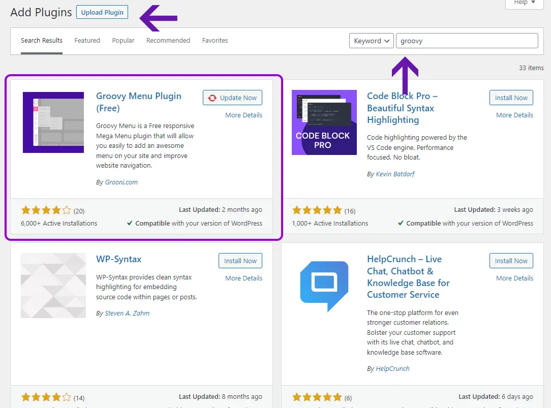
The Groovy Menu FREE plugin is a simple and effective way to add a hamburger menu to your WordPress website. For that you can follow these steps:
Note that the plugin also has a premium version that have a lot of premium features. The Premium plugin has a one-time payment, and there are no annual fees.
In this video, you will take a step by step how to install this type of menu on your site
The hamburger menu can be a useful tool for simplifying the user experience on mobile devices. By hiding navigational elements until they’re needed, the hamburger menu can help to reduce clutter and improve focus. While it’s not without its drawbacks, the hamburger menu remains a popular option for many websites, particularly those that prioritize mobile-friendliness and simplicity.